Magic Lantern

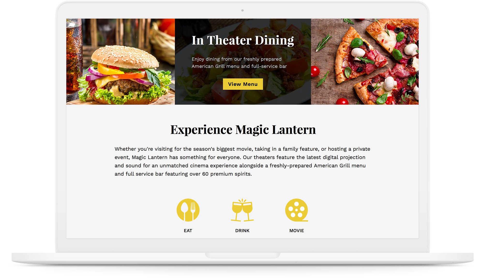
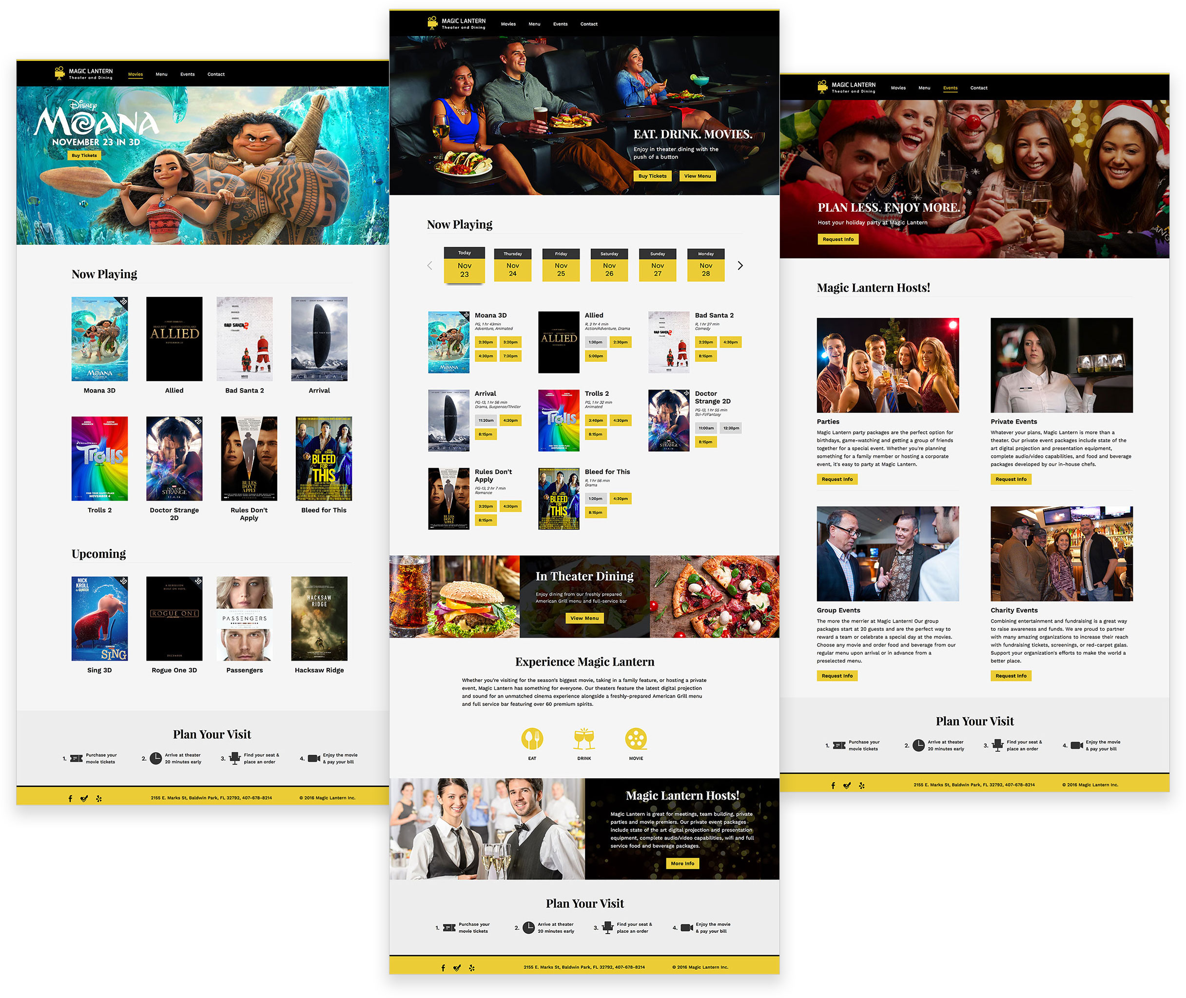
Magic Lantern is an upcoming dine-in theater in Baldwin Park, Orlando. The theater features latest digital production and sound experience for an unmatched cinema experience.

They offer a freshly prepared American style menu along with a wide beverage selection including beer and wine. Magic Lantern is also available for hosting private events and parties.

Scroll down

01

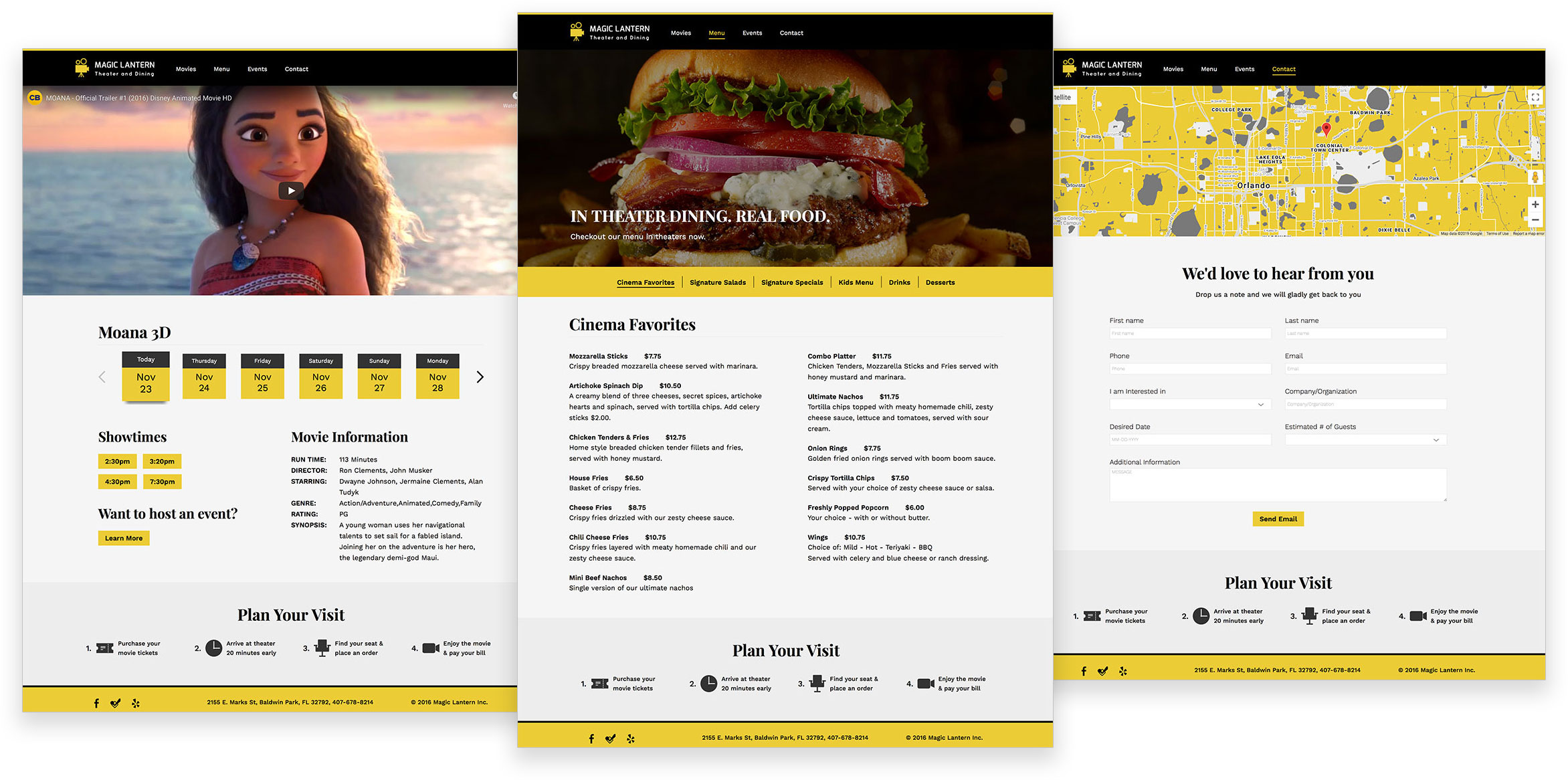
Mockups

02

Client Brief

Objective

Magic Lantern wants to launch a new website to promote their business. Along with food and movies, they want to showcase their ability to host events and parties.

Target Audience

Magic Lantern wants to target movie enthusiasts of all ages who are looking for a getaway with a nice dinner experience. They also want to attract people who are interested in hosting events with private screening.

Communication Strategy

  • Design a logo that is modern and simple.
  • Use eye-catching colors and subtle transitions to engage the user.
  • A dedicated events page with the ability to request for information.
  • Focus on the movie experience they provide.
  • Implement a fully responsive website.
  • Promote their exclusive food and beverage choices.
03

User Persona

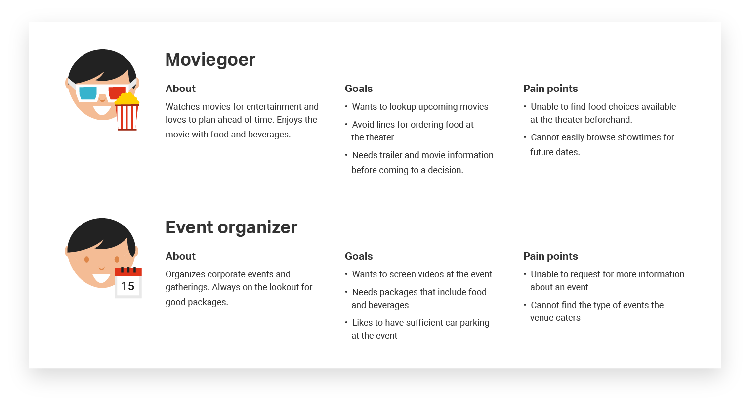
After studying the objectives of Magic Lantern, I could broadly classify the users of the website into two categories: movie-goers and event organizers. So, I came up with personas typical to both the users. I will keep their goals in mind when coming up with solutions.

04

Sitemap

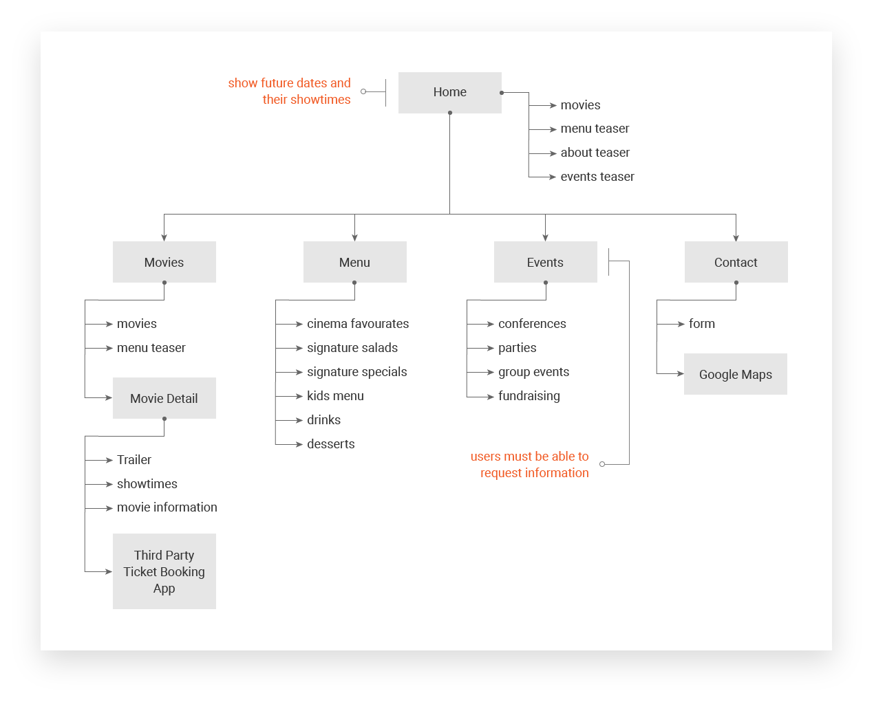
Keeping the goals and pain points of the users in mind, I organized the pages with relevant content and added notes to consider in the next phase.

05

Wireframes

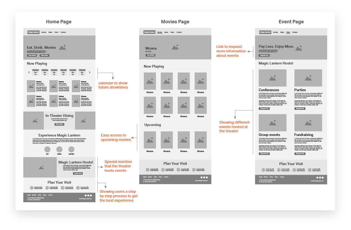
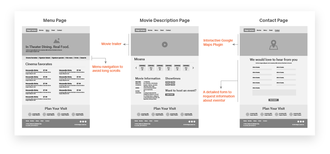
After finishing up the sitemap, I started focusing on the layout for all pages. The solutions I came up with are mapped out below

06

Type Study

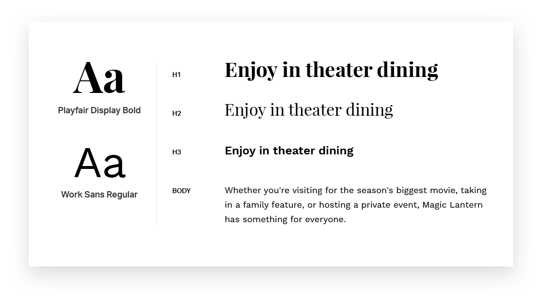
Playfair Display was chosen for its display design and modern look. It also gives a stylistic effect on headings. I complemented it with Work Sans for its strong readability at medium text sizes throughout the website.

07

Color Study

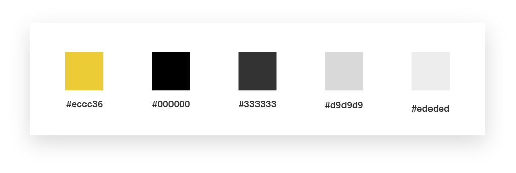
Magic Lantern is an entertainment venue, So I want to go for a bold and bright look. I chose yellow for the highlights since it is bright and immediately grabs the eye. It is also cheerful and creates a sense of excitement. I complemented yellow with black as it is bold and versatile.

BROWSE OTHER PROJECTS

Experience Orlando

New Image Youth Center

Pink Boots

Will's Pub