New Image Youth Center
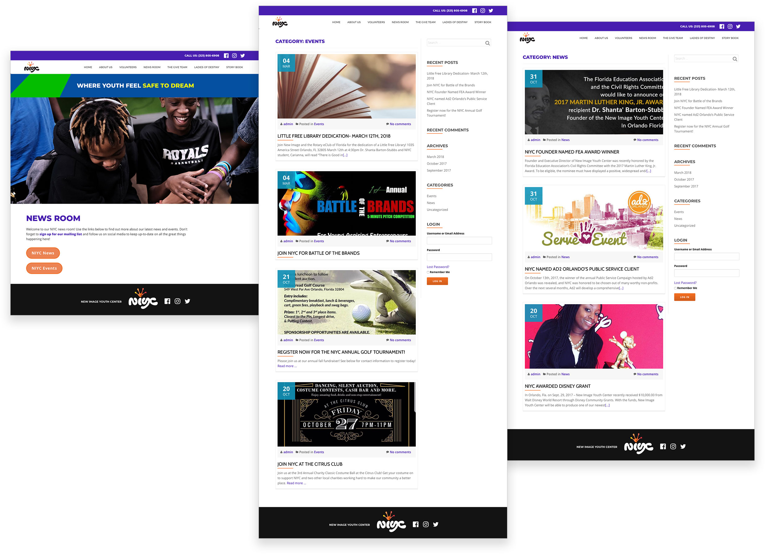
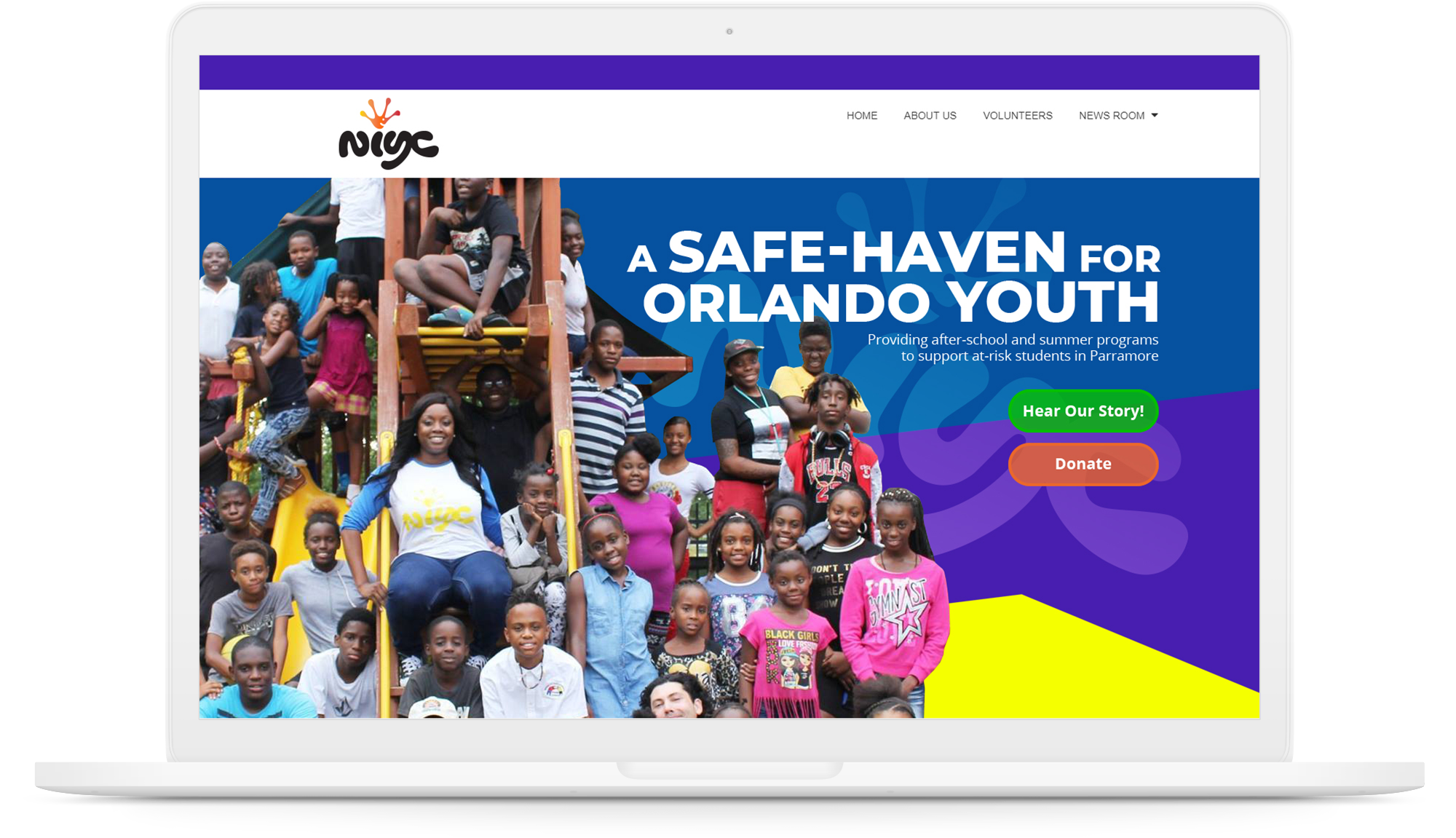
New Image Youth Center (NIYC) is a non-profit organization established in 2004 in Parramore community, Orlando. Its mission is to change the path of at-risk youth through education and example.
I was volunteering with Ad2Orlando public service team consisting of six members. My role was to design and develop the website alongside one other member.
Scroll down
Client Brief
Objective
NIYC wants a redesign of their website to attract donations. They also want their website to reflect their story and the work they do.
Target Audience
NIYC wants to target donors in the community with a special focus on corporate donors.
Usability evaluation
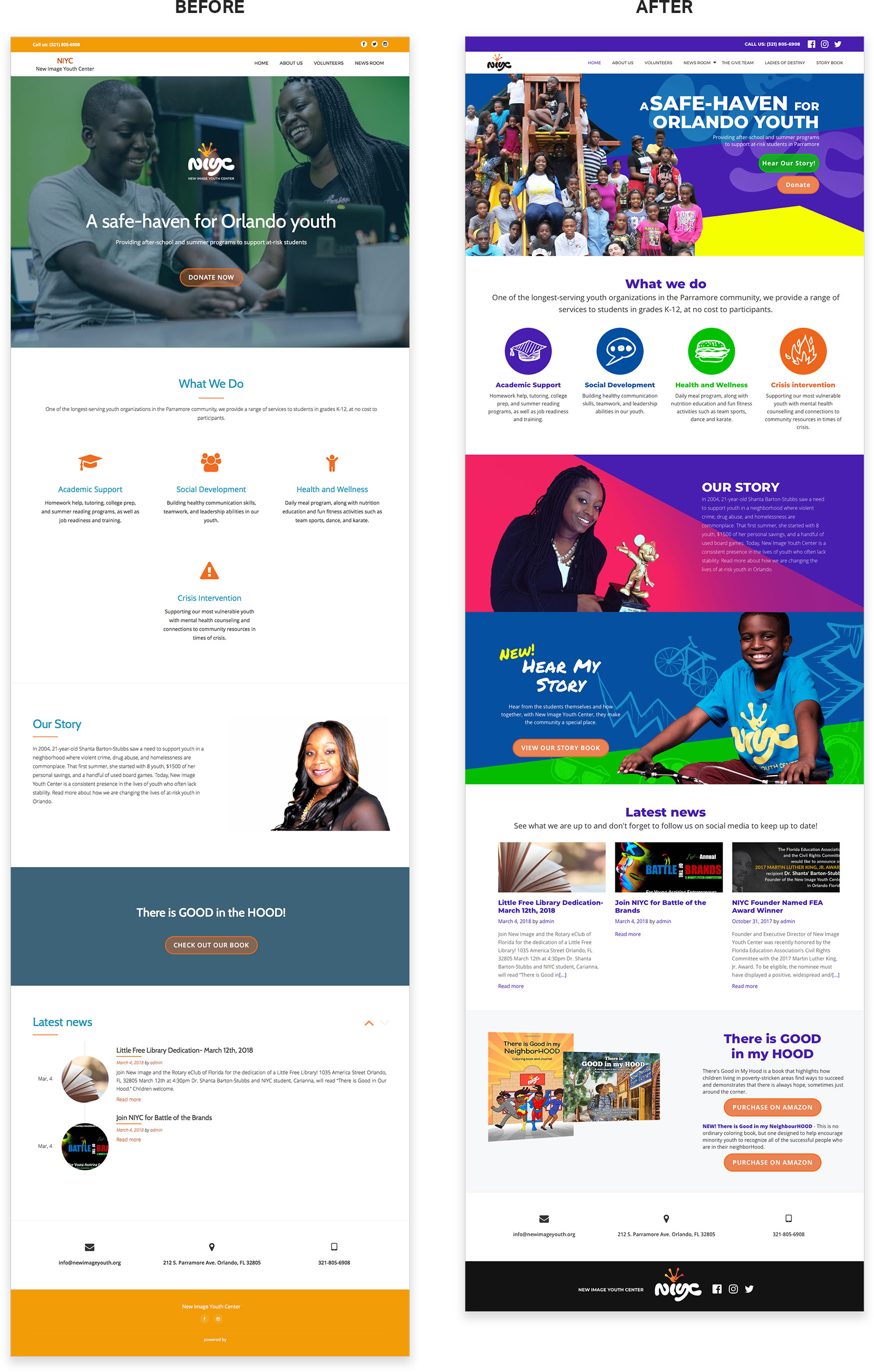
As a team, we first evaluated their existing website to determine the problems. Then we came up with the following list
- Logo usage is inconsistent throughout the website.
- Images used in the website are of low quality.
- The solo donate button used in the website is lost in the background.
- The website is boring and dull.
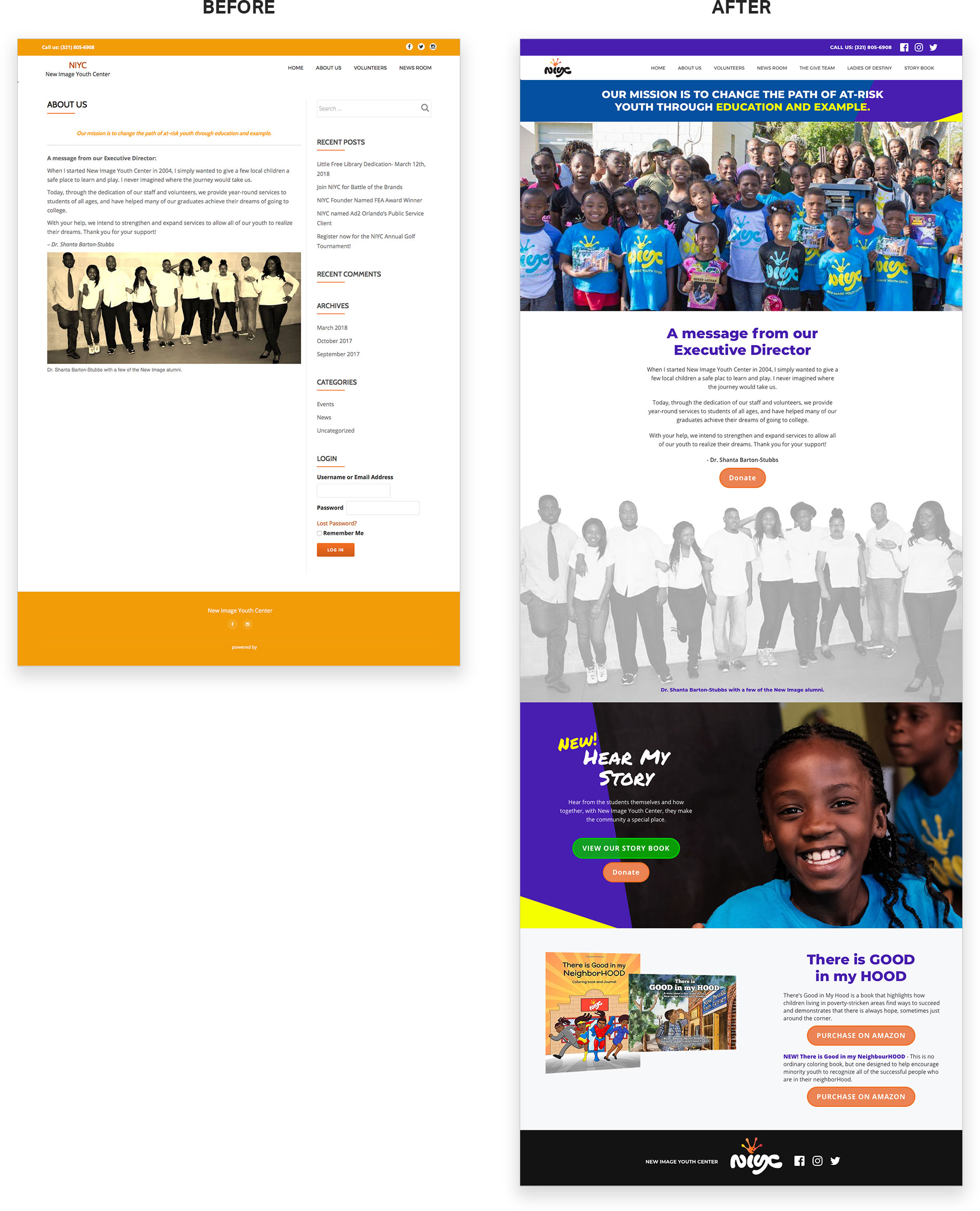
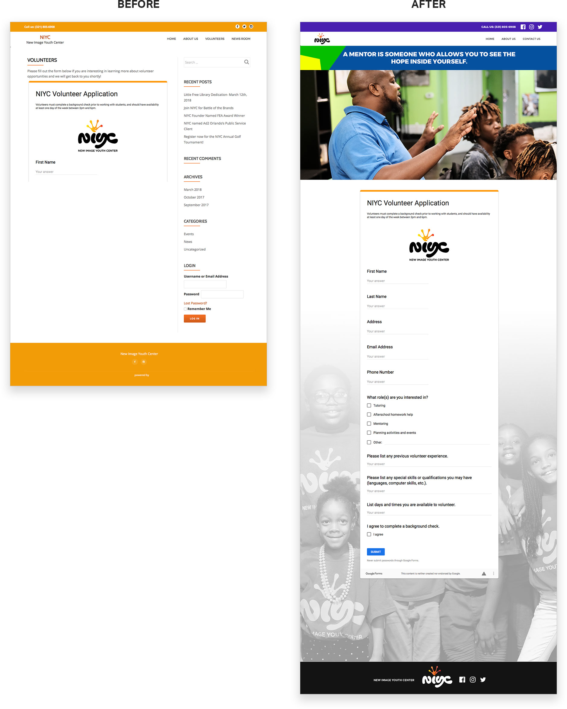
- Every page has a sidebar containing recent posts from the blog. It seems unnecessary because there is a dedicated page for the blog.
- The About us page is not appealing and needs more content.
- The form in the volunteering page is displayed in a small scrollable window.
Proposed Solutions
- Design a new Wordpress theme that is consistent.
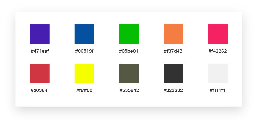
- Use bright and playful colors in the website to reflect their work with youth.
- Take high quality pictures of the students to use in the website.
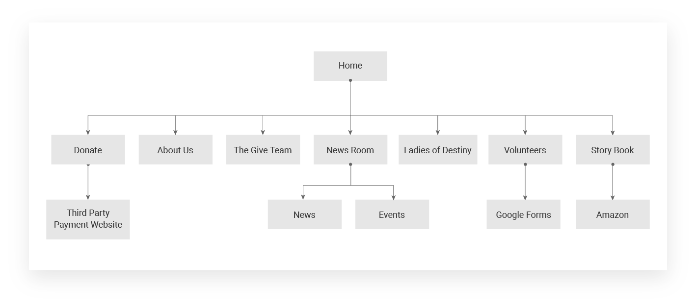
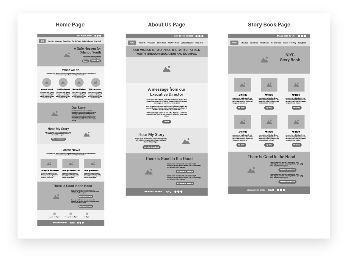
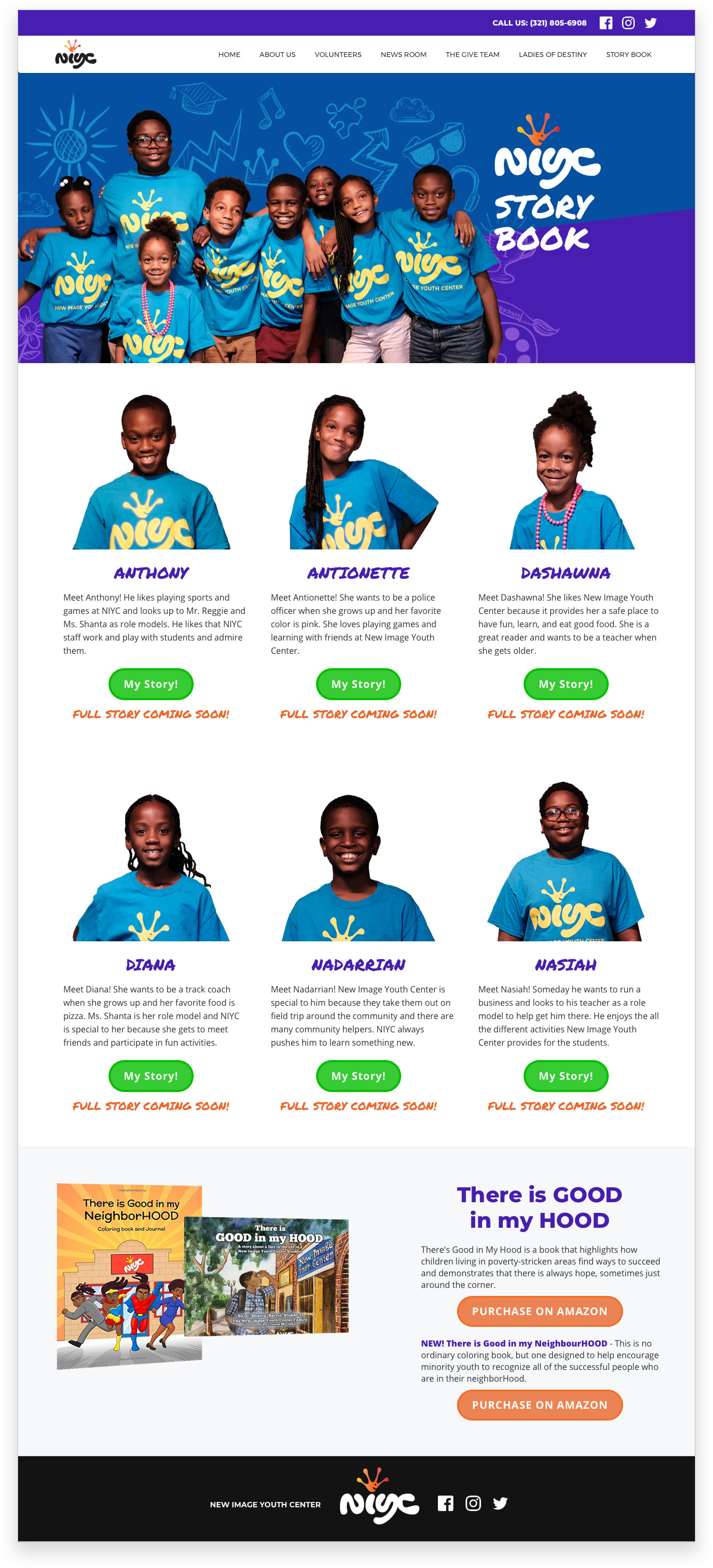
- Add a dedicated page to show stories of the kids and how the donations are changing their lives.
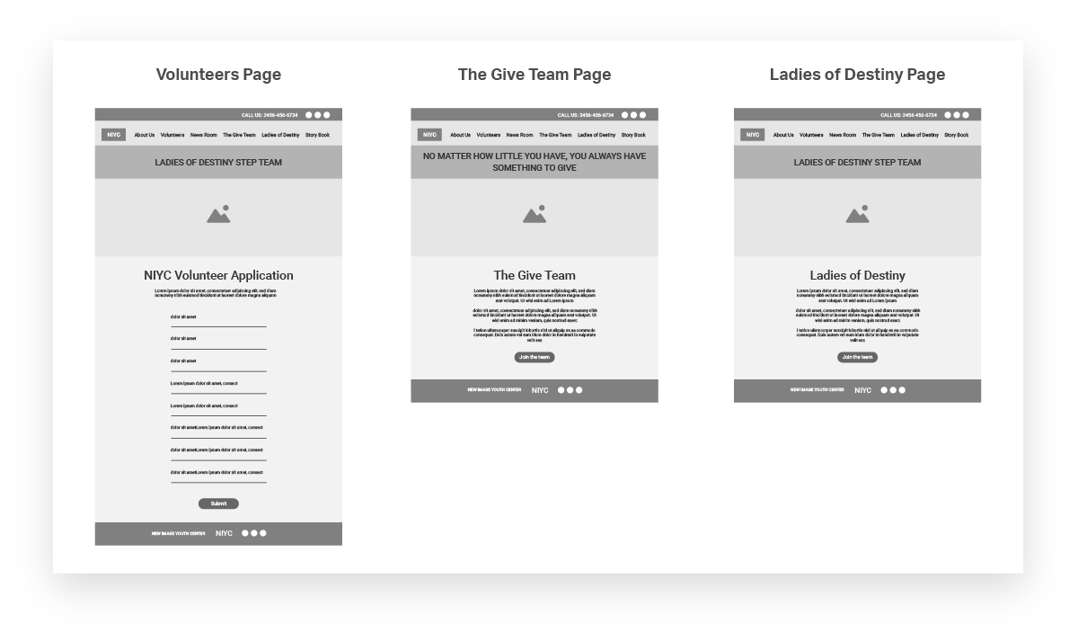
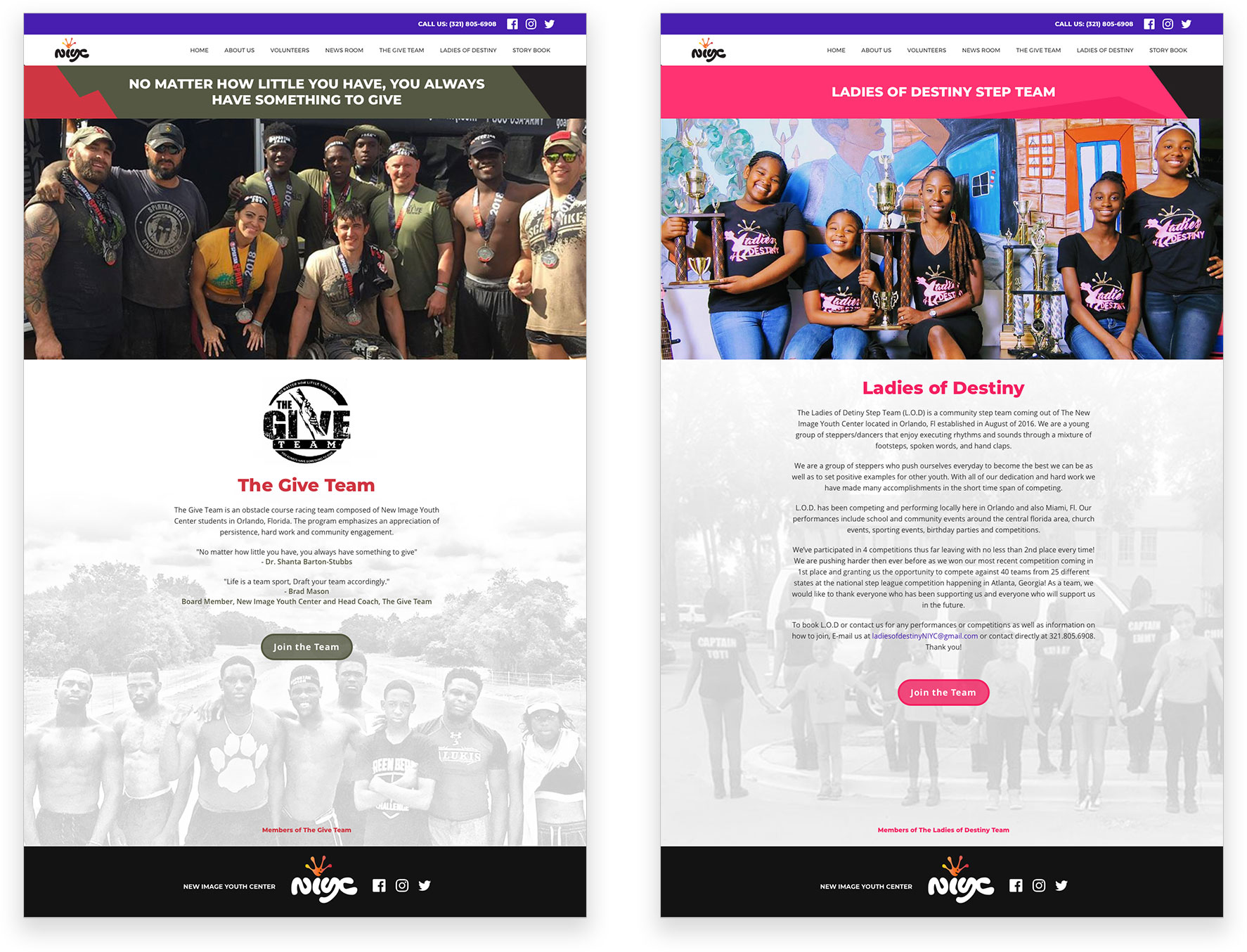
- Add dedicated pages for their give team and ladies of destiny step team.
In addition, we planned on fixing the problems we found during usability evaluation.
Type Study
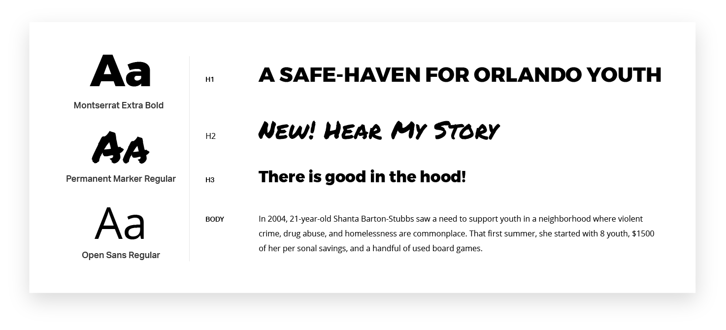
We wanted to give the website a modern look. So, we chose two san-serif fonts that paired well together. Montserrat was chosen for the geometric simplicity of its letters, especially the capitals. We chose Open Sans for body copy as it has excellent legibility characteristics in its letter forms. For the storybook, we used Permanent marker as display text to give it a handwritten look.
Story Book
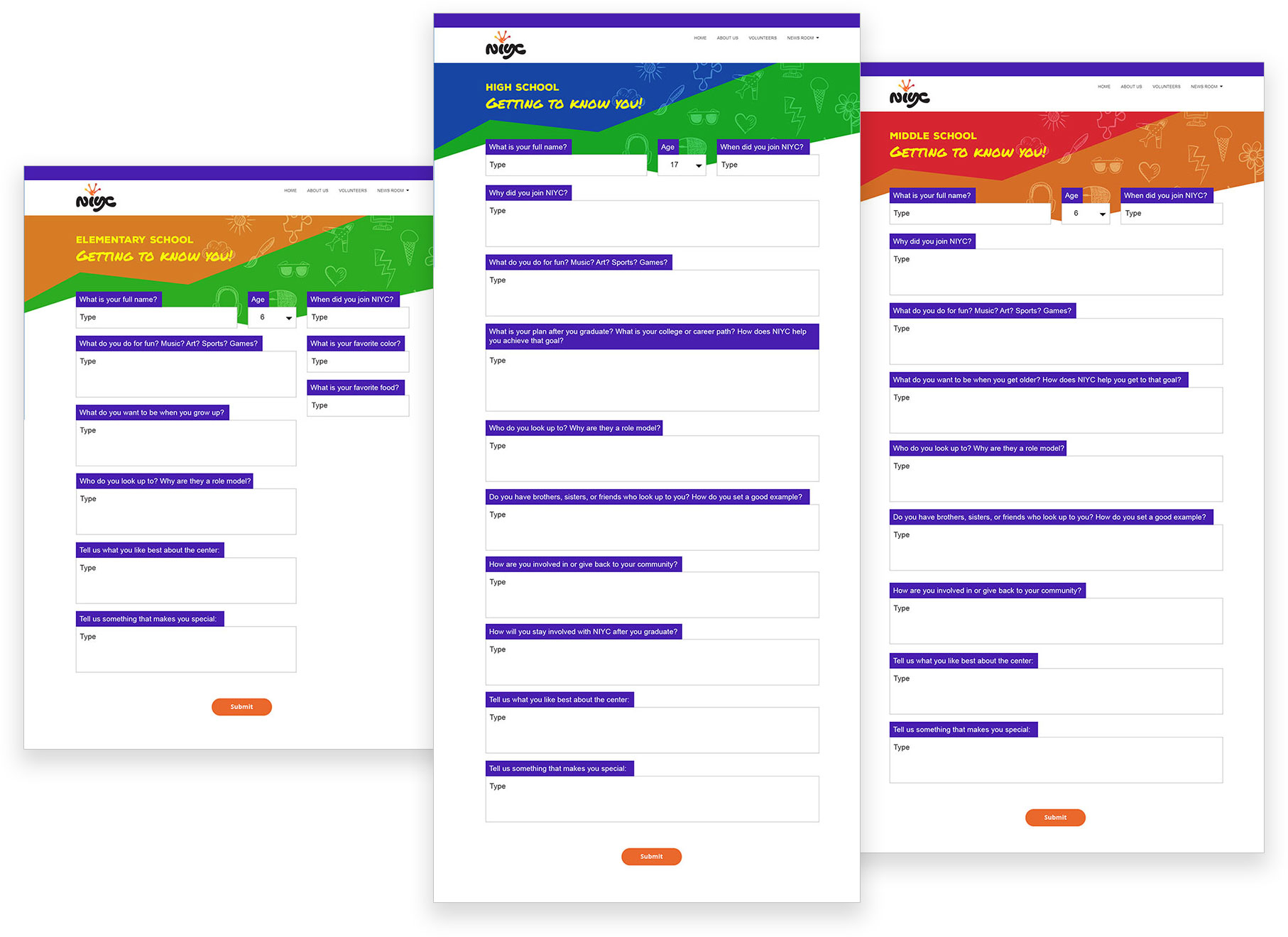
As a team, we had to come up with the content for the storybook. So, we decided to come up with surveys for each age group at NIYC. We wanted to capture the personality and interests of the kids there. We also wanted to know their view on NIYC and how it helps them everyday. After some brainstorming, we came up with a set of questions like
- What do you do for fun? Music? Art? Sports? Games?
- What do you want to be when you grow up?
- Who do you look up to? Why are they a role model?
- Tell us what you like best about the center?
- Tell us something people would be surprised to know about you?
Since it was tough to get hold of all the kids at the same time to handout surveys, we decided to add the survey pages online. Also, we setup a mail chimp campaign and captured their email addresses for future correspondence.
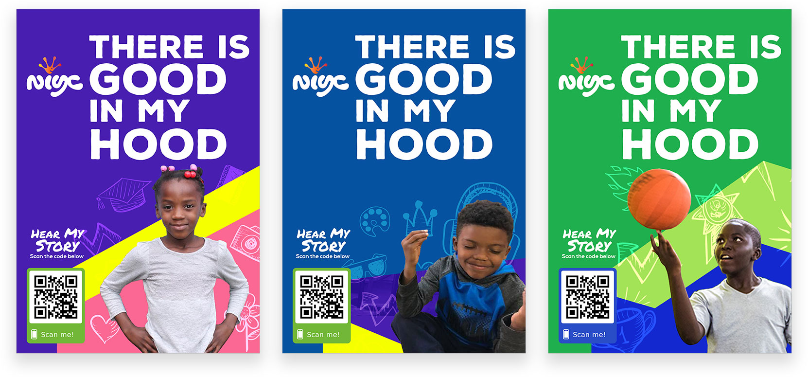
After a week, we had 82 surveys filled. We then organized photo sessions at NIYC. We had a candid photo session and were able to capture high quality pictures of the kids that we could use on the website. We then put up the storybook page with pictures of the kids along with a summary of their responses.
Results
The client was very happy with the outcome of the website. We delivered it on time. Since this was part of the Ad2 Orlando public service campaign, we presented this campaign in the Ad2 public service advertising competition. We secured 3rd place for this project nationally.
Future Work
The idea of the story book impressed everyone. So, We are planning to generate pages, for students, in the storybook based on the information we have gathered.
