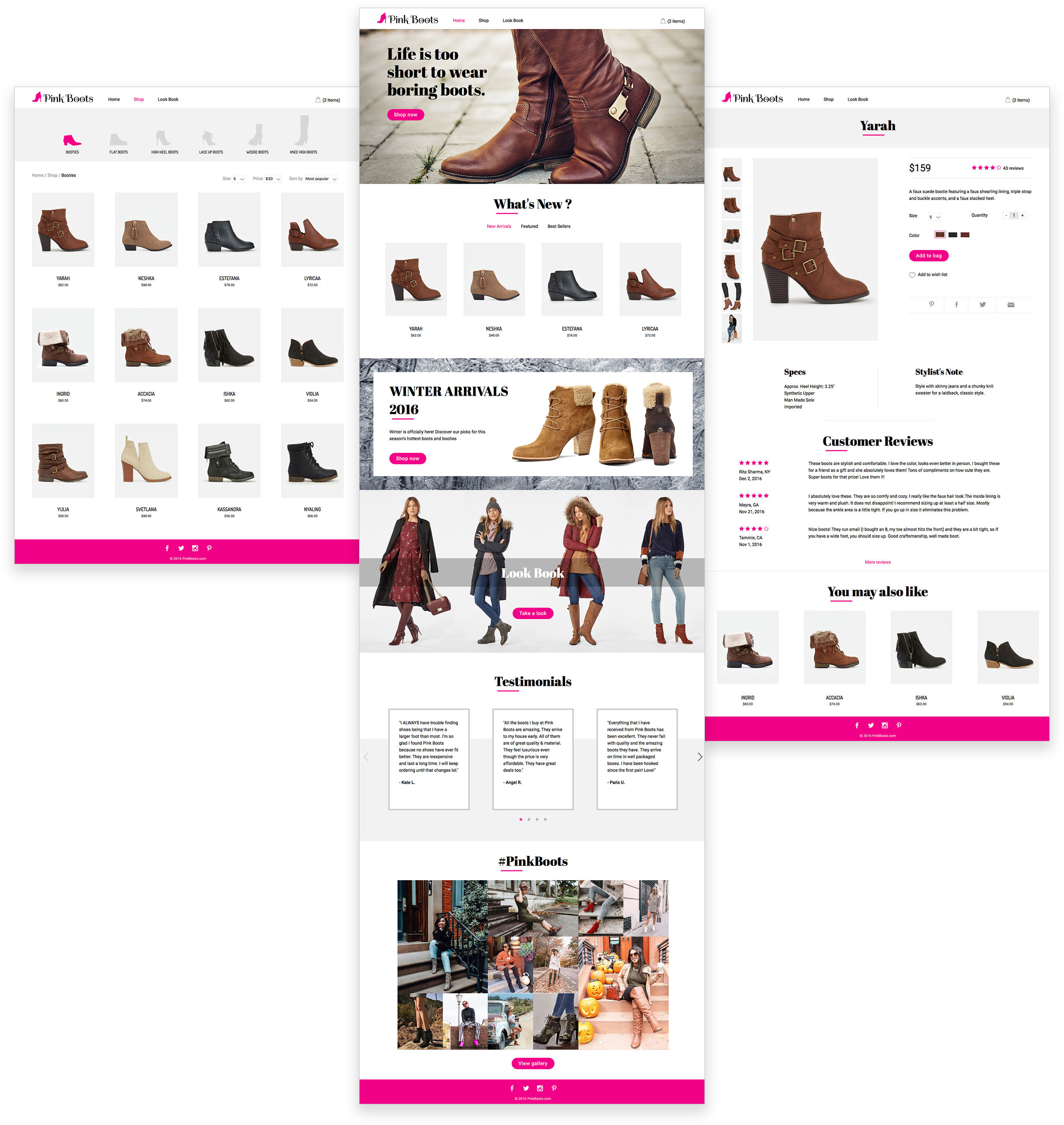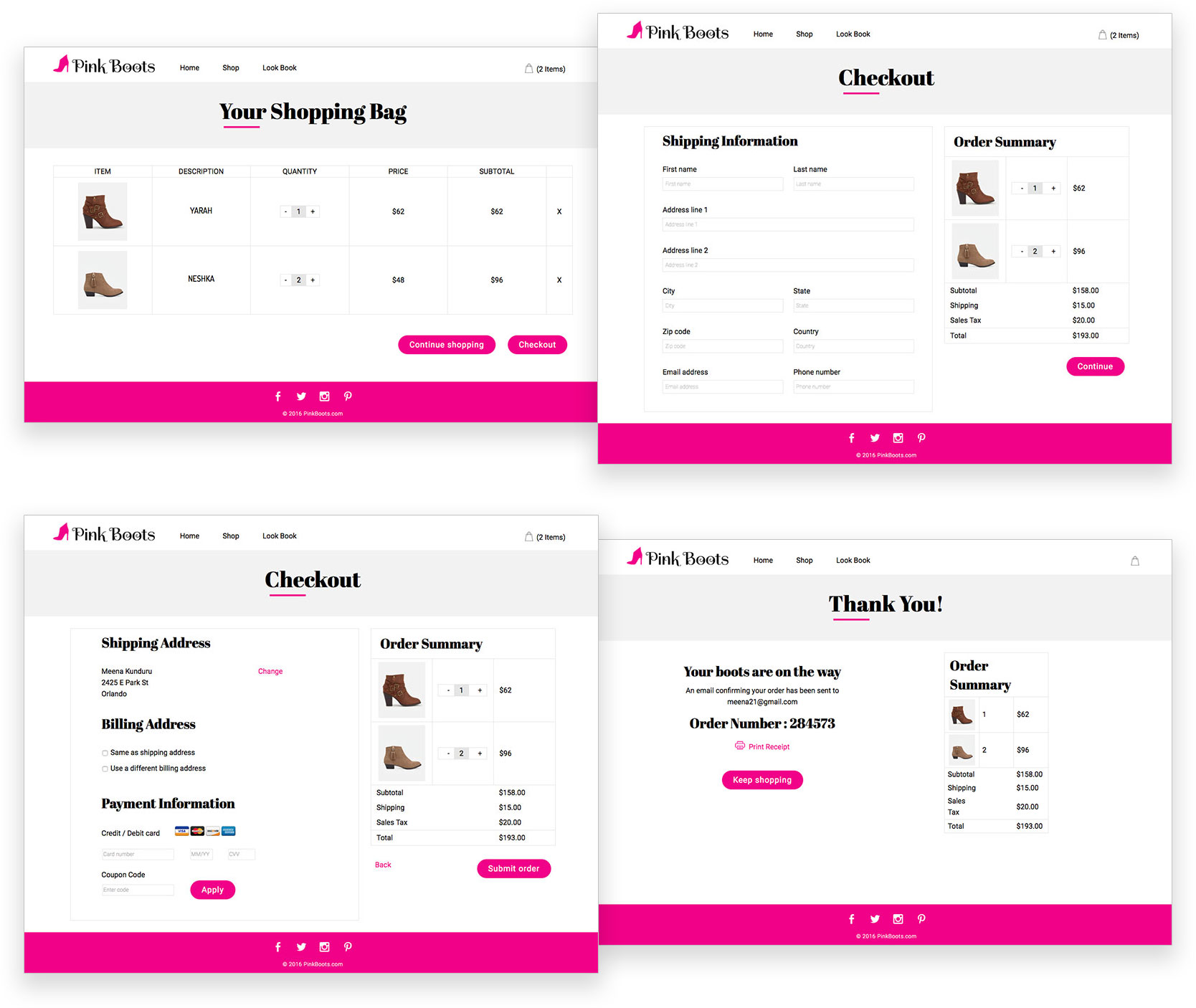
Pink Boots
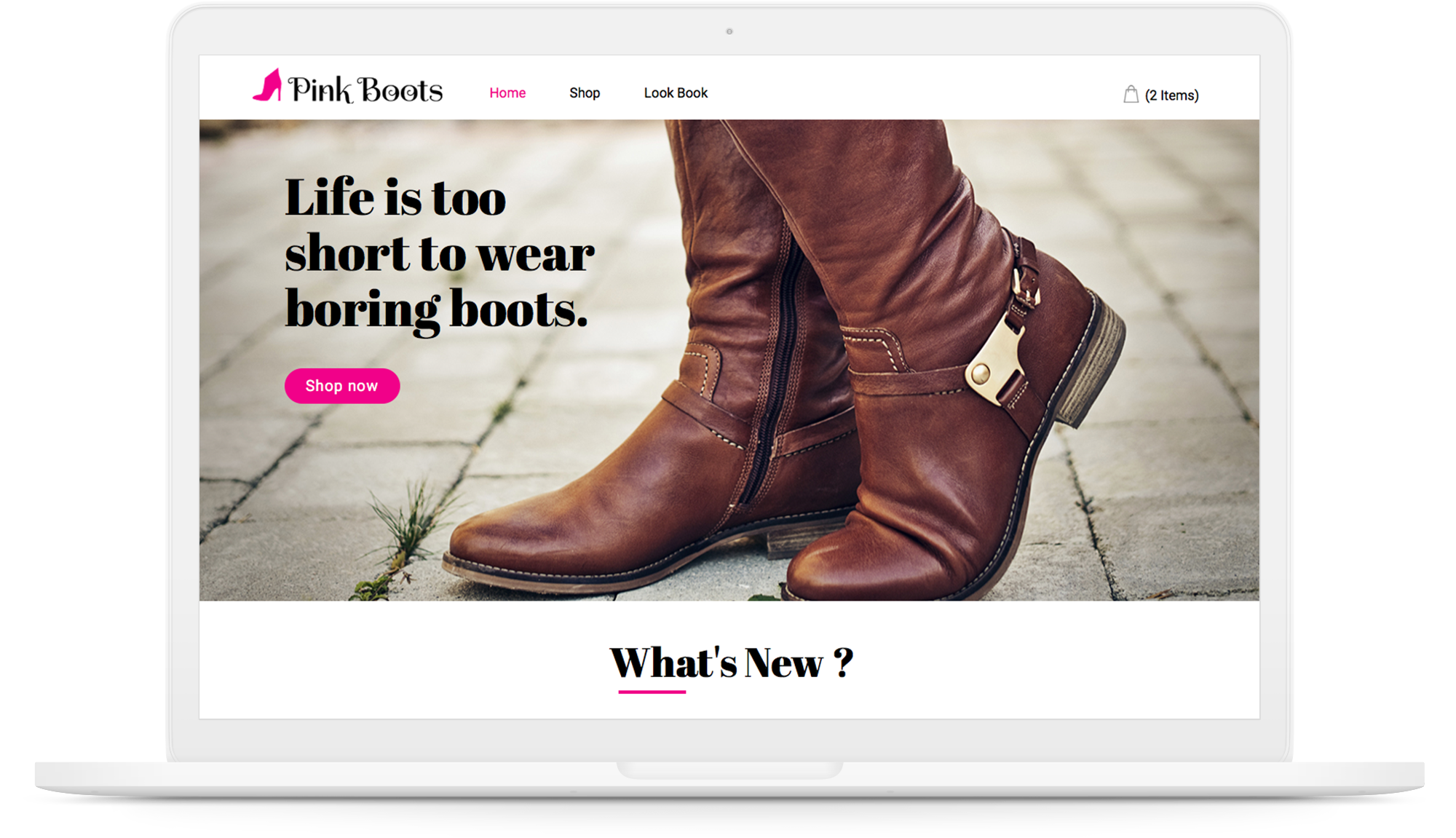
Pink boots is an upcoming online shoe store that boasts of the best collection of trendy boots. They want to take pride in connecting every customer with the boots they love. They are inclined to providing the best shipping and hassle free returns.
Scroll down
Client Brief
Objective
Pink Boots is looking for an e-commerce website as its sole endpoint of business. They want an elegant and modern website to represent their collection of trendy and stylish boots.
Target Audience
Pink Boots wants to target all boot lovers irrespective of their experience with boots. They want to focus on people looking for special boots to celebrate an occasion or gift it to their loved ones.
Communication Strategy
- Design a logo that connects to boot lovers and also to their brand.
- Easy to use interface for shoppers to find and buy the boots they need.
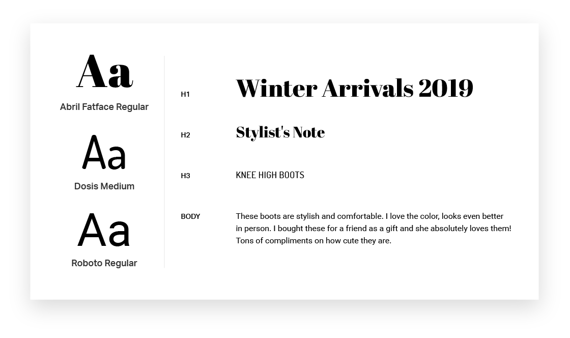
- Use modern and elegant typefaces.
- Add an instagram gallery to show current trends.
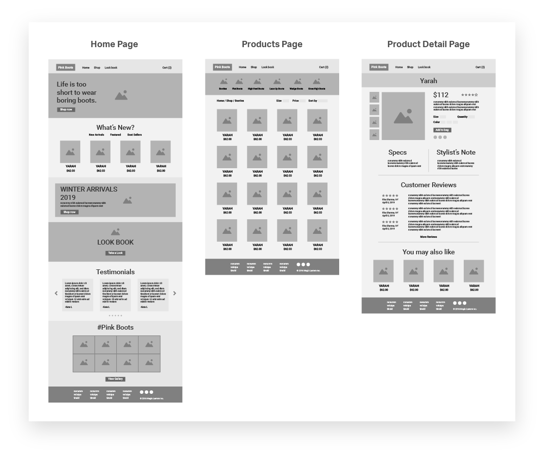
Wireframes
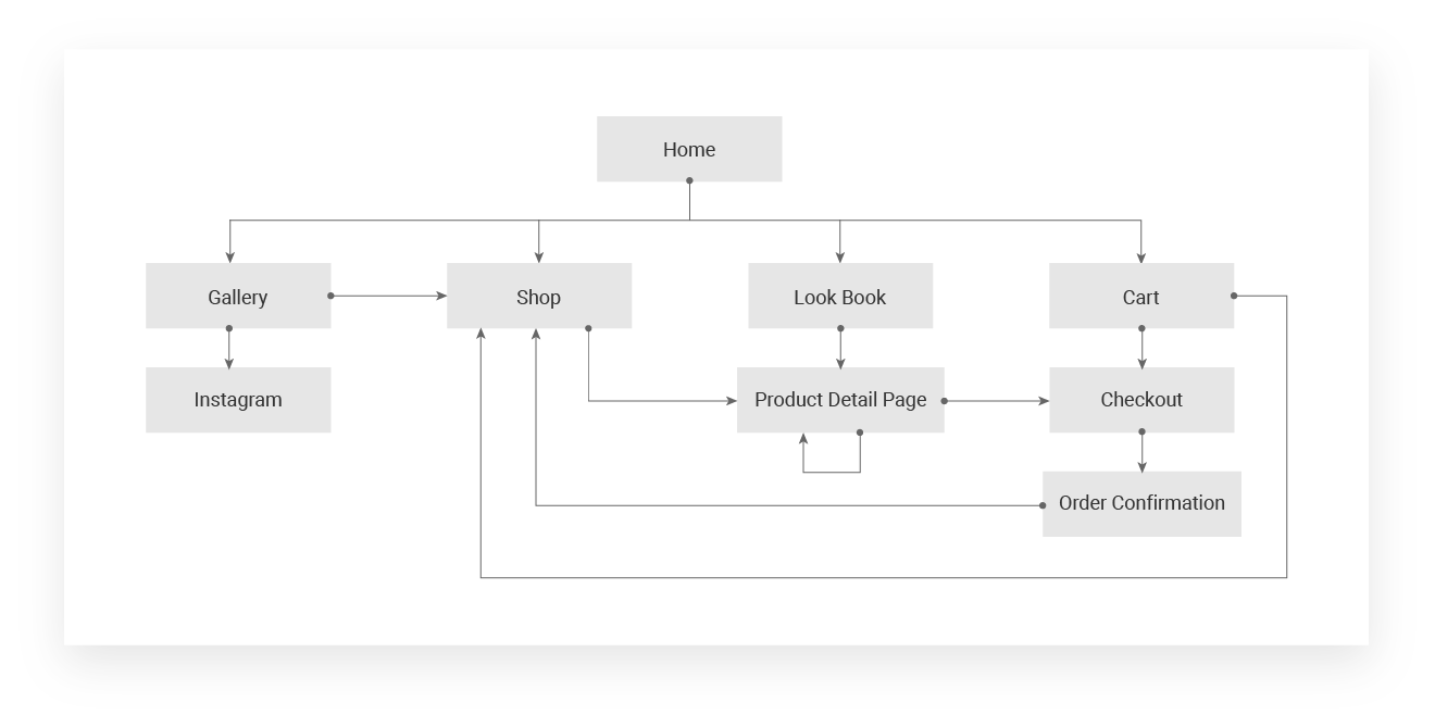
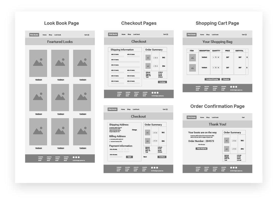
After coming up with the list of pages for the website, I started brainstorming for the relevant content on each page. I added multiple teasers like new arrivals, lookbook and gallery on the homepage for the users to start shopping. I also decided to showcase the product with a lot of images so that the user gets a feel for them.
Development
I developed the fully responsive website using HTML5, CSS3 and jQuery. For image gallery in the homepage I used a jQuery library, Photo Swipe.
